As the most dynamic and widely used method of digital communication, the internet presents the clearest opportunity to gain market presence. It is also the least expensive. However, website design and mobile development evolve at the speed of light. What's hot today will most likely be antiquated in six months.
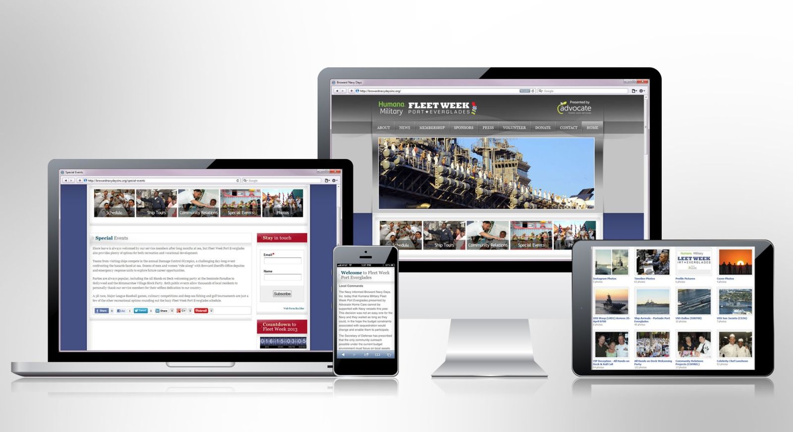
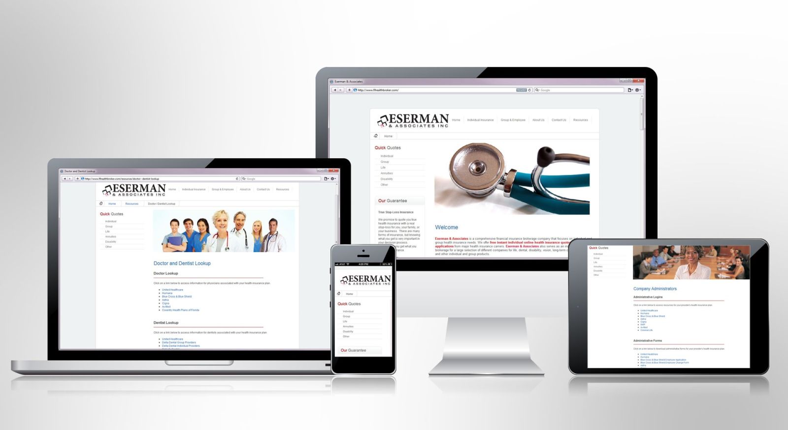
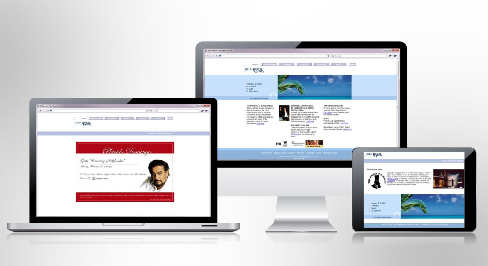
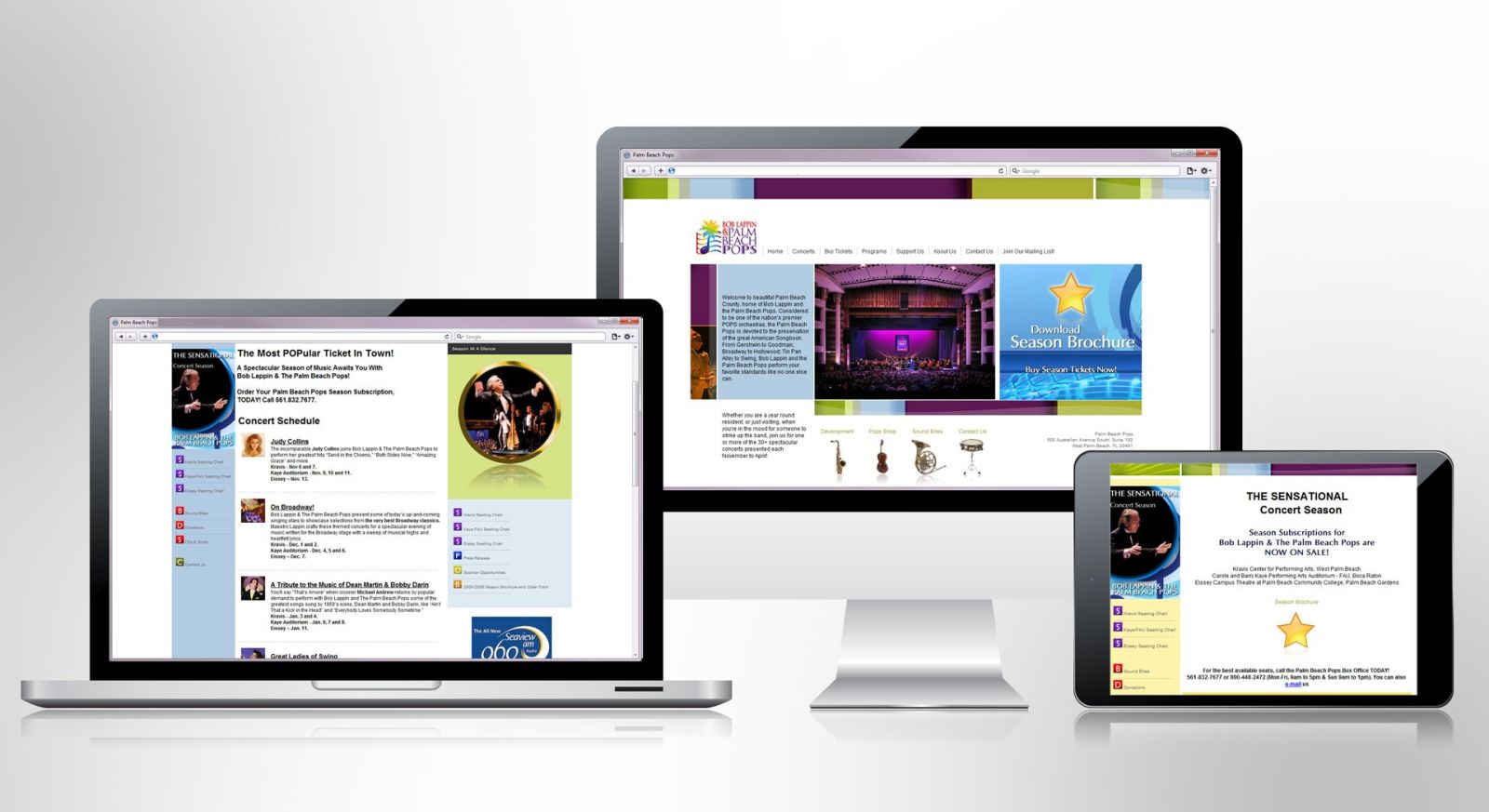
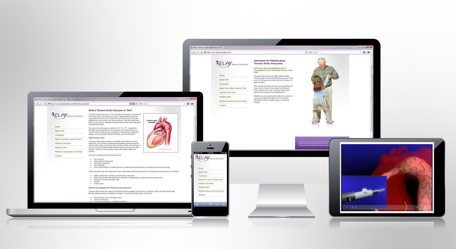
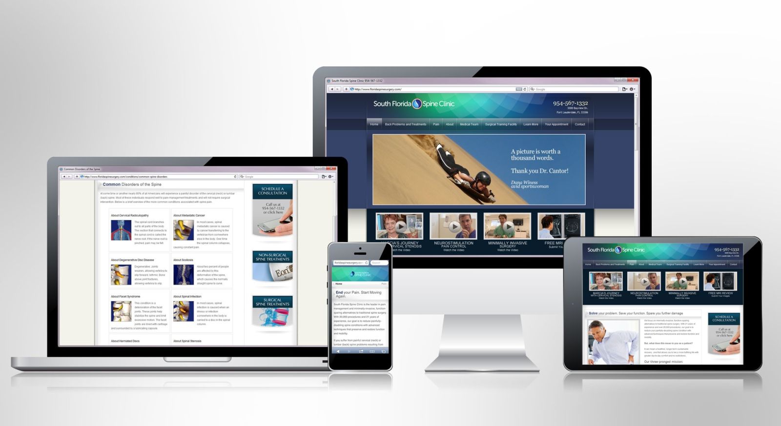
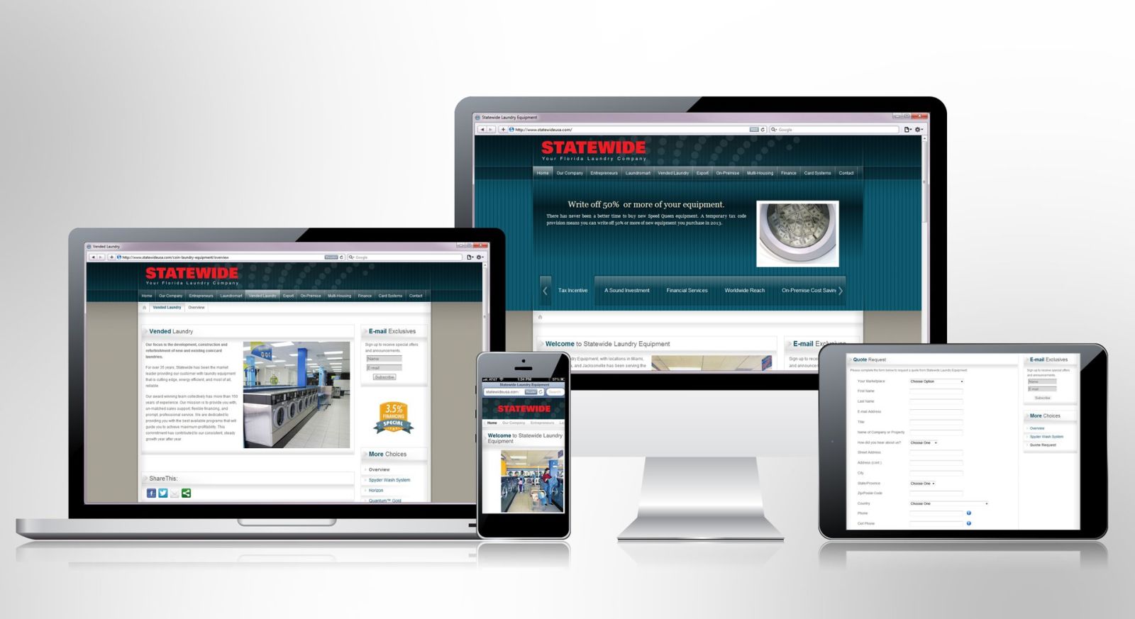
Here's proof: until recently the standard in web development was to design desktop and mobile versions of a site. The new standard, called responsive design, aims to provide an optimized experience across a wide range of viewing devices: desktop, laptop, tablet, and smartphone with one single version of a website.
BaxterMartin's website runs responsive design at its core. Go ahead and give it a try. Grab your browser's window from the bottom right (make sure the window is not maximized) and slowly make it smaller. As you change the size of the window, the BaxterMartin website automatically adjusts and displays only the content best suited for that display.
We are pioneering the way with advanced technologies that keep our clients on the leading edge. Take a look.


